I have tons of gel prints and colored papers. One of my favorite things to do is to spend hours creating collage sheets, colored coffee filters and gel prints. I love love love playing with color and pattern.
See one of my “Build Your Stash” videos where I color coffee filters. I think coffee filters are my most loved colored papers…the way they take color….the way they collage is A—Mazing.
After spending my first couple years doing mixed media and not really understanding “collage” ( I mean, why would we glue papers down only to cover them all up ??????)
I have now embraced it. I absolutely love starting my projects by collaging colored papers with different patterns. Selecting gel prints/colored papers that have different weights adds even more interest. The layering of these papers adds great texture.
Starting with collage -the colors and patterns you already have in your papers gets the creative juices flowing. They are like little signposts pointing you in the direction to create. I highly recommend starting with collaged papers especially if you struggle with getting started and the dreaded ” fear of the blank page”.
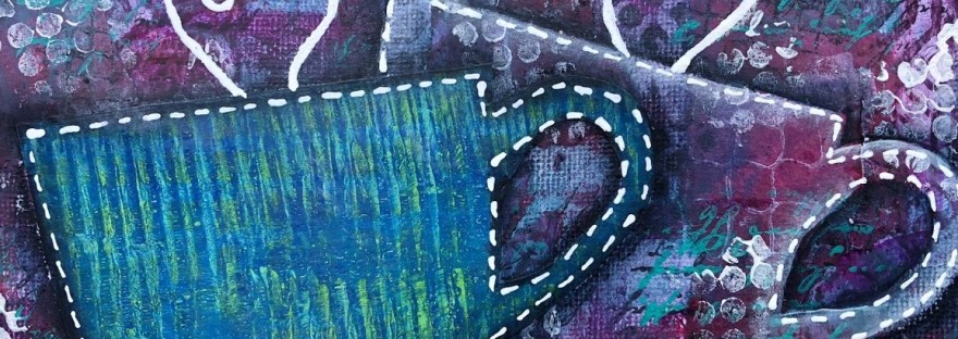
So go now, get out your gel prints or colored papers and follow my tutorial ” A Cup of Creativi-tea”
Want ideas for creating unique gel prints? And ideas for how to use them. Check out my Gel Printing Playlist- Gel Prints- Create Them AND Use Them
Need a way to store your gel prints and colored papers. Here’s my tried and true system. It’s perfect for keeping even the smallest pieces all organized.
If you create anything inspired by something you saw here, please come share it in my Facebook Group – Mixed Media Creations. I’d love for you to come join the “creationships”
using DIY stamps made with fun foam- roller or regular
picking a focal point
altering magazine pictures to collage on your page
picking colors that work together-complementary colors
edging the page
adding shadow with charcoal pencil
splattering
Materials Needed
I am making every effort to limit the materials needed to items you can buy at your local dollar store, thrift store, Walmart. Supplies will stay mostly the same for each project. Use what you have. I am limiting myself to them as well.
Mod Podge Matte
gesso- Walmart brand- does not have to be expensive artist grade
assorted sizes paintbrushes
re-purposed children’s book- see first post for selection and preparation or purchased journal with heavier paper ( mixed media preferred)
dollar store or other brand craft acrylic paint – 3 bright colors , black and white (pick colors that go with your magazine picture chosen)
Magazine pictures of butterflies, flowers etc. ( coordinate with colors chosen)
makeup sponges
homemade stamps made from fun foam, cardboard /lint roller
charcoal pencil
baby wipes
paper towel
meat tray or plastic lid for paint palette
black permanent marker/liner pen/gel pens
old credit card/gift card/hotel key card
heat tool or hair dryer
*if you have a higher quality item, you can definitely use them. For instance Liquitex Basic Acrylic Paint or Liquitex Modeling Paste, or watercolor pencils/crayons. Often I will discuss options on the accompanying video.
Click on this link if you want to make some stamps like those used on this page.
Process
Gesso page using paintbrush or with credit card. Dry with heat tool/hair dryer .
Paint entire background black with black acrylic paint. You may need to spray a bit of water to help spread paint, especially if you are using more expensive paint.
Select 3 brighter colors that you feel will show up on the black background. If you have neon colors, they may work well. I chose lime green, red and teal. I used my lint roller that I had stuck torn pieces of fun foam onto. You can make one similar to this without a roller. Cut 2 pieces of cardboard and glue together. Make it the size of your sheet of fun foam. Glue a layer of fun foam on top of the cardboard. Now rip pieces of fun foam into random shapes and glue them onto the fun foam.
I discovered that the easiest way to apply the paint onto the fun foam was by painting it on with a paint brush. I dried the paint after each color. Be prepared for the color to get a bit duller ( due to black background). I put lime green first, then red. When I went to choose the third color I noticed that the lime and red kind of made orange/red. When I looked at the color wheel I noticed that teal or blue-green was the complement of that shade , so I chose that color. Complementary Colors lie opposite each other on the color wheel. These colors always go well with each other. Some of the most popular color schemes are based on color complements. If stuck on what color to make a background or focal point, check out the color wheel.
I had planned on putting butterflies on this page. You could do the same or pick any magazine picture you have that will go with the page. I wanted to stay in the same complement color scheme, so I chose butterflies that were red-orange. If you started with a picture, pick colors that go with the picture.
You do not have to use the magazine pictures as they are in the magazine. The partial flower on the right side was attached to the picture on the left. I cut it out and placed it on the other side in order to bring the color to both sides. Balance the whole page. The butterfly on the left was from a different page.
7. After using Mod Podge to adhere the butterfly and flowers. I searched PInterest for butterfly quotes. This is a great source of inspirational quotes. I have a board in Pinterest where I collect them.
8. I printed out the quote and cut it into chunks. I have found that if you cut them into single words, the page gets too busy. I outlined each chunk with my Micron permanent black pen. I used sketchy lines. I did this, as I had noticed many purchased sentiment stamps have that and I liked the effect.
9. I tried out several arrangements. I put the word butterflies on the second page to lead your eyes to the second page. I used Mod Podge to adhere the words down.
10. Dip make up sponge in a little bit of teal acrylic paint. Dab off on palette. Rub around edge of page. I chose teal as with the pictures I felt I had enough red/orange.
11 . Outline the words and pictures with my charcoal pencil, and then smudging it with my finger. You can use watercolor /inktense pencil for this, but instead of rubbing it you will activate it with water.
12. Put a small amount of white acrylic paint on palette. Spray a small amount of water and mix paint . Dip small paintbrush in paint and tap the handle of the brush with another paintbrush to cause spatters. You may want to try this out on blank paper before doing it on your page, just to get a feel for the technique.
13. Apply layer of mod podge over all the page to ensure that it all has same finish.
NOTE: If at any time you get paint where you don’t want it, because your bottom layer is acrylic you can use a baby wipe and clean it up if you do so before it’s dry. Acrylic paint is permanent when dry. Many of the sprays, watercolors, gelatos etc are not permanent and will re-activate if you wet them. Using acrylics makes things much easier.
I created a Facebook group so we can come together to share what we’ve all created and develop creationships that support our individual creative journeys. Come join the group and join the conversation. The group is called…
All Things Mixed Media: CreativeKady
Click this link to watch the accompanying video.
This is the third article in a series. Missed the second article click here.
I love this Christmas card. I love everything about it. NOW!
I was so excited to borrow a poinsettia stamp from my friend Yvonne. I planned on stamping onto the Strathmore Watercolor Card with black StazOn Ink and then use watercolor to paint it.
Then I decided to use my Inktense Blocks by Derwent. I wet the blocks and painted the poinsettia shades of pink, red and green. I added multiple layers and was very happy when I dropped in blue near the center of the poinsettia. It was looking good.
Then I turned my attention to the background. I wet it with my brush and dropped in the colors I had used into the background. It didn’t take long before I flashed back to when I did watercolor ( last fall) and how I used to do backgrounds first. That was my first mistake. I persevered. What resulted was a very watered down background that was very pastel- like. I wasn’t happy with it so I set it aside and did other cards. You can watch the YouTube videos by following this link which will take you to the Christmas playlist. There will be at least 4 Christmas card videos there to watch.
Still not happy with the cards, I decided to redo the background. What did I have to lose? I was going to toss them anyway. I used a couple shades of green and blue and rubbed the brush on the Inktense Blocks to create a very wet and pigmented Thro background. The pink you see was there from my first background. When I was happy with the background I sprinkled salt on it. The salt gives it texture. It pulls some of the pigment in adding lots of dimension to the background.
I got out my Lindy’s Starburst sprays and opened them up. Dangerous I know. I used the Poinsettia Red Gold for the flowers. See the shimmer of gold. I used Ponderosa Pines Olive for the leaves. I applied the color with a very fine liner brush. The green had a silver blue tinge that looked too grey so I used my Wilton Juniper Green homemade spray over top. Then I outlined all with my Micron Pen.
I wanted to add some gold to the background. But how could I stamp over the poinsettia? I decided that since I couldn’t I would splatter thinned acrylic gold paint over the whole card. Here is card #1.
Then I remembered I had seen people stamping the stamp on paper and cutting it out to make a mask to cover what you don’t want to get stamped. So that’s what I did. I used my Old Letter Writing Script stamp and applied gold acrylic paint with a makeup sponge. Here is card #2.
In the end I got two cards I am very happy with and I used a couple different techniques I’ve never done along the way. I wouldn’t have done either if I had just tossed these cards. So, word to the wise. Don’t throw out your mistakes. Work with them and learn the lessons they have to teach you.
This angel is a very special angel. I made this just after my dear Aunty Mary passed away. She was a quiet, witty wonderful aunt who always took time to spend special moments with me , both as a child and once I became an adult. The last time I saw her was at my wedding 5 years ago. As usual there was a special 1/1 time for us. She also always took great care to pick the perfect card and always wrote her own special words in it.
As I was thinking about her and the special times I had with her, I wrote the memories on this journal page and then covered them all with gesso and then this angel.
Her eyes were the brightest blue and they always sparkled, so I knew that blue would be the main color on this page and that there would be sparkle on the page. The time just before the funeral we had our first snowstorm-well rain followed by freezing closing highways and making travel treacherous. I knew that I would incorporate that aspect too.
I sprayed the pre-gessoed page with several blues and purples of my homemade Wilton sprays. While still wet, I sprinkled it with sea salt and dried it with the heat tool. When dry I brushed off the salt.
I used some snowflake stamps with blue StazOn. A weird thing happened and the ink seemed to be absorbed by the spray , fading it somewhat. I then used same stamps and applied iridescent medium onto the stamp with a makeup sponge and stamped all over the page.
I dug out my old folk art books and found the snow angel. I cut out various parts out of my gelli prints that I created with my GelliArts gelli plate. I glued the pieces to the page with gel medium. I added faux stitches on underdress, hearts and wings with black and blue gel pens. I added the word love and the hearts to the pattern.
Lastly I outlined all the parts with my black stabilio all pencil and activated it with water.
This was the first time I journaled under my art. It was a good way to remember and honor my relationship with my aunt. Now when I look at it , I think of her and it makes me smile.
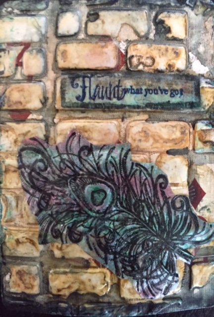
Flaunt What You’ve Got is made on a playing card. I obviously didn’t apply a coat of gesso or paint prior to applying the bricks, as you can tell. The red of the diamonds can be seen in the gaps. It doesn’t take away from the finished product , but you could paint the card black or white prior to the brick.
I used Flexible Modeling Paste from Liquitex through a homemade brick stencil. You can buy a brick stencil from many of the brand name stencil makers. Be sure to wash the stencil after using it with modeling paste as it will dry hard and could ruin your stencil.
I clean up the edges with a palatte knife and then use my heat tool to dry the modeling paste. If you put the heat tool too close or hold it in one place too long the modeling paste will bubble up. To get the look I achieved I did just that. I wanted it to bubble , and crack to make the brick looked weathered.You will notice that some of the bricks puff up. I press down some of them with my finger after it has cooled a bit.
I then sprayed the card with Lindy’s Starbursts sprays called ” Steampunk Sepia” and a very little bit of Shabby Turbine Teal. I applied the sepia spray twice, drying between layers of spray. Yes, the paste will still bubble and puff up. The two toned sprays with their gorgeous shimmer get into all the nooks and crannies.
I stamped my peacock feather stamp and sentiment on deli paper and sprayed it with my homemade metallic acrylic sprays and adhered it to the card.
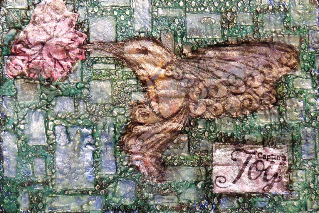
This ATC was done in a very similar way as I described above. The difference is that I mod podged a colored paper towel onto the card prior to applying the modeling paste through the brick stencil. You can see the wonderful texture that adds to the card . On this ATC I used a couple of my homemade metallic sprays in blue and teal. I stamped the hummingbird, flower and sentiment on deli paper that had been sprayed with the same metallic sprays.
Make It Your Own
While my examples in this post are all done on Artist Trading Cards, you can use the same technique on a journal page or on a canvas.
I used a brick stencil for these cards, but putting modeling paste through stencils to add texture and pattern is one of my most favorite techniques. I have done it with most of my stencils. Just be sure to clean them right away.
I used Flexible Modeling Paste. I love the effects I’ve gotten , but it was just what I got my hands on. You could use any modeling paste, light, heavy and any brand. Play with them and see what they do. You could even use wall compound that is used to fill cracks in walls. This is much cheaper, which I love and can be found in many hardware or big box stores.
I used Lindy’s Starbursts sprays and my homemade metallic sprays. You can use whatever sprays you have. They do not have to be metallic or have shimmer. If you don’t have sprays you can thin out any acrylic paint ( Liquitex or craft paint) with water and paint the brick. If you want shimmer you can add dollar store silver paint or iridescent medium ( I bought Artist Loft brand) rather than the more expensive Liquitex or Golden.
Lost your inpiration ? Want to challenge yourself? Want to use your supplies ? Want to keep out of an art journaling rut? Then this post will help you do just that.
Just after I started art journaling I decided to make myself a set of inspiration prompts. I had been watching a lot of YouTube Videos and was writing down different techniques and supplies that I saw being used and that I wanted to try. I also saw several videos where people made different kinds of prompt cards. I even watched one where the artist was selling hers.
I decided to make my own. First I made a set on the back of playing cards. But even as I was making them I realized that they needed to be organized into categories. So I switched geers mid inspiration deck and did just that.
I brainstormed as many prompts as I could. Then I looked over all the prompts and decided to use 6 different categories: Paint or Ink Mediums, Texture, Pattern, Color and/or Theme, Techniques and Additional Details.
After typing them up I printed them off on deli paper. I bought tongue depressors at our local dollar store. I chose to buy the pre-colored ones to save myself a step. I used Mod Podge Matte to adhere the prompts to the sticks. I put one on each side of the stick.
HOW DO I USE MY INSPIRATION STICKS
Most often I pick a stick of each color. Since there are prompts on each side I get to “pick” which one fits best. I allow myself to turn in only 1 stick and repick, but you can make your own rules about that. Now I have the basis of my new journal page. I’ve seen others on YouTube do them in the order they draw them. I don’t do that. I look over my series of prompts and start to pull the materials specified. Then I pick a prompt to start with . The art journal page Where Flowers Bloom Angels Sing was created using prompt sticks in this way. Here’s the link to my YouTube video showing it.
Another way I use my Inspiration Sticks is when I’m stuck in the middle of a page and don’t know what to do. I grab a handful of sticks and look them over. Usually it doesn’t take long before I find one that is ” just right” and makes the page.
When I started the blog I wanted to find a way to “treat” my email followers with little “gifts” periodically . I will be mailing out a link to all my present email followers that will give you the Word document where I’ve typed up all my categorized prompts. You will have to click on the link to get the document. Now depending on what kind of word processing programs you have, kinds of fonts plus plus plus the formating I did may or may not come exactly Don’t panic or email me. All you will need to do is save it to your word program ( if you have Word, try to save it as a Word Document) and reformat it selecting fonts you have/like. You will also be able to delete those prompts that don’t work for you (materials you don’t have or even things you will never do) I promise I won’t take it personally . Start with what I send you and make it your own.
Let me know how this works for you and how you made it your own. Also , would love to hear ways you use your Inpirational Prompt Sticks.
Tomorrow’s blog will be another art journal page tutorial where I use the prompt sticks to guide me.
If you watched some of my videos you know that I love using the salt technique frequently on my journal pages. I use it with my homemade Wilton sprays, Inktense Blocks and Lindy’s Starburst Sprays. But did you know you could use this technique with acrylic paint?
I didn’t either . At least not until I did a YouTube video seeing which color mediums the salt technique works with. You can find that video by clicking on this link.
The background created for this ATC was made during the video. On this background I used the following Liquitex Basic Acrylic Paints. Ultramarine Blue, Hookers Green, Bright Aqua Green, Light Blue Permanent and Old Gold.
Onto a gessoed card I applied a generous amount of aquamarine blue with about half as much of each of bright acqua green and light blue permanent. I sprayed each with water and mixed loosely with my finger. I added a touch of hookers green afterward with a bit of water. When using the salt technique you want to have a bit of liquid for the salt to soak up. I applied sea salt to the card taking care not to sprinkle it on most parts.
If I was doing this again I would mix each paint color with water prior to putting it on the card. I believe this will amplify the effect of the salt technique.
After it was dry I gently brushed off the salt with my fingers. You can feel the texture the salt created. I then put some of the Old Gold Liquitex Basic on my craft mat. I dipped a makeup sponge into it and applied it to my Hero Arts “Old Letter Writing” wooden stamp. I stamped the card so the script was vertical.
Now, it was August when I did this, but for some reason when I looked at the background I saw a Christmas tree. So I happily dug out my new Penny Black Christmas clear stamps and using Versamark stamp pad stamped the dangling ornaments across the top of the card. I poured white embossing powder on it and activated it with my heat tool.
When that cooled, I got my small letter stamps and stamped the word JOY onto the card using Versamark Inkpad. I used white embossing powder again. To finish the card I edged the card with the makeup sponge and gold paint.
Instead of Christmas Cards I may just send out Christmas ATCs. No two would ever look the same even if you use the same paints each time. I love that.
Would you mind getting an ATC like this instead of a card? Creative Kady


 Complementary Colors lie opposite each other on the color wheel. These colors always go well with each other. Some of the most popular color schemes are based on color complements. If stuck on what color to make a background or focal point, check out the color wheel.


![IMG_4506 [1386284]](https://creativekady.files.wordpress.com/2015/11/img_4506-1386284.jpg)


