ICAD

ICAD # 25 Step By Step ” Seize the Day “

Before I tell how I created ICAD # 25 I  wanted to talk about something else.

I’ve had a bit of a rough go of things lately.  You all know how busy things have gotten for me. End of school year. Almost retiring- so packing up/ getting rid of teacher stuff. Relocating to retirement home – getting house ready to sell, packing, purging and preparing. What you may not know is that through the last month I’ve also been dealing with severe back and knee pain. Truly I am not saying this to get you to feel sorry for me. I am saying it to point out the great benefit I get from going into the creating zone.

The Index Card A Day was just the right thing for me this June. It gave me a purpose. I promised to do all 61 ICADs  and I promised to blog or video them and share them on Facebook.  Now I know the ICAD , YouTube or Facebook  police were not going to come and demand I fulfill my card a day promise and I could easily have given up. But that’s not me. A promise is a promise. That promise was enough to get me to the art table.

When I sat down at the art table something wonderful happened. As I started to create I discovered that creating art was a powerful “pain killer” . I forgot about all the things I need to do, but can’t do. I forgot about all the uncertainty in my present situation. For a few hours every day I was able to escape it all and just be happy. I wish this for all of you.

IMG_5476 [150892]

As usual I prepare the flashcards by applying a couple layers of gesso. When I do this I typically do 3-5 of them. Just going through the motion of “painting” puts me into creative mode and I start to get ideas for what I am going to do. When I am stuck this is one of my go to activities for this very reason.

IMG_5477 [150893]

I applied two colors of Dylusions paints; Cut Grass and London Blue. I applied them with the blending tool and blended until I liked what I saw. I wanted sky above and grass below.

IMG_5479 [150895]

Next I taped one of my new stencils over it. I find just a couple strips of painters tape can help me prevent seepage under the stencil . I purchased this stencil in the home decor area of Michaels.

IMG_5480 [150896]

Using my palette knife I applied Flexible Modeling Paste. I dried what you see above and then moved the stencil to get the “lattice-like” effect down the middle as well. Because the modeling paste wasn’t exactly even some of it was less than white , so I took my Big Brush Pitt marker in white and went over they lattice so it was all a bright white.


IMG_5502 [386744]

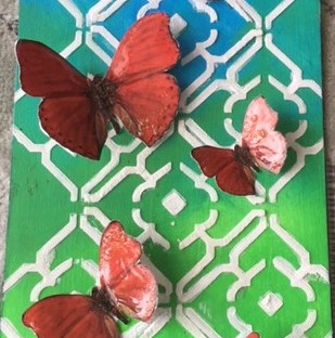
Once the lattice effect was done I went looking for flowers/vines to put climbing up the lattice. In my search I came across these butterfly free printable. I did some fussy cutting and played around with placement. When I have something I like I take a picture with my phone. Looking on the phone gives a slightly different perspective and I find I can compare several different compositions which allows me to select the best one. The red-orange of the butterflies really pop against this background . If you check your color wheel , you will know why- they are complimentary colors to the background. I glued the butterflies down with matt medium. I only put it in the middle so the butterfly wings stick up and give a 3D effect.

IMG_5504 [386746]

Needing something more I painted over the butterflies with Liquitex Pouring Medium. This gives the butterflies a shine that makes them stand out even more. Warning, let the pouring medium dry on its own. I attempted to use a heat tool and caused the liquid to bubble ( even though I was not overly close) . I did not like the effect of the bubbles as I want a smooth glossy surface. Guess I had a lesson to learn.

You can see the finished ICAD below. I selected a quote from my dollar store stickers that matched the color of the butterflies as well as the feel of the card.

VISIT MY AMAZON STORE

 I’ve done the work for you and organized my store by categories. Everything I chose is CreativeKady approved- I either own it OR want to own it.

http://astore.amazon.com/creativekad05-20

Posca Pen- white – http://amzn.to/2aSvvpi

Liquitex Pouring Medium-  http://amzn.to/2b7lqaT

Liquitex Flexible Modeling Paste- http://amzn.to/2aSxbiF

Acrylic Paints    http://astore.amazon.com/creativekad05-20?_encoding=UTF8&node=1

Dylusions Paints     http://amzn.to/2ckMYrw

IMG_5513 [386747]           Want to see the other ICADs I created? Click on this link and it will take you to my ICAD playlist in YouTube.

ICAD

ICAD # 13 Step by Step Tutorial “Time Flies”

IMG_5399 [3401283]

Truer words were never spoken. Time flies when you are having fun. Time flies too when your dreams are about to come true. So much to do. So much to think about. So what do I do- go down to my studio. It’s the only room in the house that is not “staged” for the purpose of selling the house and escape into the act of creation.  I am finding the ICADs just the right thing. They are quickly done ( no more than an hour of actual time) and they challenge me to use things from my stash as most of my “good stuff” is already on Vancouver Island , waiting for me to use them this summer.

I started this card by giving it a good thick coat of gesso. Then before it dried I got out my dot stamp and stamped into the wet gesso. I grabbed my heat tool and applied heat ASAP so the imprints would not run together.  If you can look at the second picture you can see the texture that was left by the stamp. Just be sure to wash your stamp quickly. Also, I wouldn’t recommend using a fine stamp like a script stamp as it may get clogged.

IMG_5385 [3401272]             IMG_5386 [3401273]

While this dried completely I went on to stamp out some clock stamps on white paper using my StazOn black ink pad. I fussy cut them out. Of course since I wasn’t sure which one would work best I  cut out both. I then took black paint and painted the edges. I just wanted it to stand out a bit more.

IMG_5387 [3401274]                IMG_5393 [3401277]

I played around a bit with some wing stamps seeing if I could add them to the clock face to make ” time fly” . I wasn’t happy with the look so I selected a butterfly free printable. This one was just black and white so I got out some bright pink paint and painted it- pink, black and white. My full size Liquitex Basics are out west, so I am using these “baby” tubes.  These are a great size for trying out the Liquitex Basics to see if you are going to like using the thicker acrylic paint. I have heard so many people who were used to working with craft paint who bought Liquitex Basics or similar and just didn’t like how they worked. I love and use both, but you do need to experiment and find out how to use each. The little tubes that you purchase in different size sets are perfect for this.

IMG_5391 [3401275]             IMG_5392 [3401276]

Now that the gesso is completed dry I grab the 2 colors of Dylusions paints that were left behind; Calypso Teal and Cherry Pie. I used the Ranger blending foam to apply each color onto the card. I kept adding more layers, drying in between, until I was happy with the blend. Sorry, guess I “lost” the picture of the card before I added layers to it. I love using teal/turquoise and a pink color together. Where they blend together they create this lovely purple shade. Once dry I assembled all my bits and figured out how to arrange them. I sourced the sentiment from a dollar store sentiment sticker sheet from my stash. I cut it/altered it to fit my plan. Remember you decide how to use the items you bought. Nothing has to be used exactly as it was. If you look below you can see how the texture created by stamping into the wet gesso is highlighted when you add color over top.

IMG_5394 [3401278]I used gel medium matte to adhere all the pieces. Quite by accident I discovered that when you go over a shiny plastic sticker with matte medium the shine is greatly lessened.

I outlined the butterfly with my Stabilo All Pencil in black and activated with water to shade the butterfly. Next I grabbed my stylus and using the bigger end I made dots to show the “flight path” of the butterfly with pearl paint.  There’s a close up for you to see the texture and the dots.

IMG_5400 [3401284]

IMG_5401 [3401285]


IMG_5405 [3401286]

After I added some extra doodling with my silver Gelly Roll pen.  Time flies when you are having fun. Time flies when you are creating.   Wishing you all some happy creative times.

VISIT MY AMAZON STORE

I’ve done the work for you and organized my store by categories. Everything I chose is CreativeKady approved- I either own it OR want to own it.

http://astore.amazon.com/creativekad05-20

If you like the ICAD tutorials, don’t forget to check out my YouTube Channel. I’ve created a playlist where all of the videos are housed so its easier for you to find all of them. Here’s the link

Happy creating.

Karen/CreativeKady

Art Journal Pages, Techniques, Uncategorized

Art Journal Tutorial: “I Say Yes”

IMG_4682

I decided the join the Journal52 Facebook Group, based on the recommendation from my creative friend, Yvonne. Each week they post a prompt that you can  use as the basis for an art journal page.  I’ve given myself permission to choose not to do any prompt that doesn’t speak to me, but so far the prompts have mirrored what I was thinking about.

This week the prompt was ” What are you saying yes to?” This was the week that I had committed myself to finalizing my decision to give my notice that I will be retiring at the end of September. As you can see above I am saying yes to the future, to my dreams and to adventure.

Here’s how this page developed.

IMG_1493 [877959]          IMG_1497 [877961]

I chose my color scheme but picking out gelli prints that I had created using my DIY Texture Plates and my GelliArts Gelli Plate. I used StazOn black and stamped the jar image on the gelli prints. This stamps set is from Hot Off the Press. Then I stamped the cloth ruffle onto coffee filters that I had put unused paint or spray into  that would coordinate with the prints selected. I cut out all of these.

IMG_1494 [877960]

I typed out the words using font Fishfingers and printed it off onto paper that was a bit thicker than regular copy paper. I find it stands up better than copy paper.

IMG_1499 [877967]

After I gessoed the page and dried it. I started applying my acrylic paint when I realized that I wanted to add some texture. I used my Liquitex Light Modeling Paste and applied it through this Dylusions stencil. I then dried it with my heat tool.

IMG_1498

I applied Phthalocyanine Green/Phalo Green and Prussian blue paint with my fingers rubbing into the stenciled texture. I continued adding paint, blending the two colors with my fingers and with a baby wipe this I got the effect I liked. Then I dried it thoroughly.

IMG_1502   IMG_1500

I applied gold acrylic paint onto my wooden script stamp and applied it all over the page. You can see what a lovely effect this is. In some places the script is clear while in others it’s not. This is fine with me. It adds lots of interest and dimension to the page.

IMG_1496

Using my Liquitex Gel Medium-Matte, I adhered the words onto the jars and then the jars and the ruffles onto the page. I put a coat underneath and then one on top. I then used my Stabilio All Pencil and traced around the words, jars and ruffles. I used a narrow brush and activated the Stabilio All Pencil and carried the black out a bit. I wanted to make the jars stand out from the background. I went around the edge of the page with the Stabilio All Pencil, but this time I activated it with wet fingers. I didn’t want such a precise shadow effect.

At this stage the page cried out for gold letters spelling out the word Yes at the top.

IMG_4682

IMG_1507

I picked out some letters from alphabet stickers I had been gifted, but since they were silver and black I first applied a layer of gesso and then my gold acrylic paint. When I put them on the page I wasn’t happy so inspired by the video of my creative friend Yvonne Gebauer I got out my Lindy’s Starburst Sprays. I sprayed it with several sprays that had the colors purple, teal and gold in it. These were the colors of my jars plus the gold stamping. I sprayed several layers drying it between until I got what I liked.  I glued them on with my gel medium and made shadows around the letters with my Inktense Block.

Here is the final page and some close ups. I love the texture, the little bit of glimmer and the colors of this page. What are you going to say “Yes” to this year?   CreativeKady

IMG_4682

IMG_4683

IMG_4684

Advice to Newbies, Art Journal Pages

How to Finish Your Art Journal Page: It’s All About the Details

IMG_2661

Today I finalized my word choice for 2016. I did this, not because other art journalers are doing it, but because it feels right for me this year. This year will be one of many huge changes. There is a high chance that I will be retiring from the teaching profession after 30 years. My husband and I plan to move to Vancouver Island for our retirement. This may also happen this year.  While all these things are things I want I know that the reality comes with questions, feelings of being overwhelmed and self doubt. There is a saying that says ” All great changes are preceded by chaos.” I just want to remember to trust that we are making the right decisions and if something is meant to be it will happen. I just have to trust and breathe.

But this is not the focus of this post. This post is about how to ” finish” your art journal page. Frequently on the various Facebook groups I belong to someone will post a page and say, ” I think I’m done, but it’s missing something.”  It is those little ” somethings”  that this article is about.

Here is my page prior to the addition of the little somethings. Beside it is the after all the little additions are made.

IMG_4649 [165700]                   IMG_2661

The first thing I did was outline/shade the flower petals and centers with my black Stabilo All Pencil. After drawing around each shape I activated the pencil with a wet brush. I colored around the page with the same pencil and activated it with a wet finger.  There are many different materials you can use to achieve the same effect including watercolor pencils, gelatos, Inktense Blocks or Pencils, Neo-color IIs or even a charcoal pencil. You can edge a page with acrylic paint or ink  on a makeup sponge or blending tool. I’ve seen others rub their ink pad against the edge of the  page  as well. Since this background is done with acrylic paint I could shade with a angle brush , acrylic paint and water as well ( throw back to folk art days).

I decided to outline my letters with white to make them stand out . I used my Posca paint pen. This can be done with gel pens, White uniball signo pen, or thinned white acrylic paint with a liner brush. I’ve even heard of people using white corrector pens for such detailing.

Since I felt “something” was still missing I decided to outline the flowers with the white Posca pen. Then I went around the edge with the white as well.

Final step, I splattered thinned white paint with a fan brush over the whole thing. I did this to ” lighten the page” and correct a mis-step I made earlier .Even before I glued the flowers on, I was tempted to do a white wash over the whole background as I found it was too dark.  It’s amazing what a little splatter will do. Don’t have a splatter brush, you can use any brush or even a toothbrush. If you haven’t splattered, you may want to practice before you do it onto a page. The good part about this background  is it is all  done with acrylic paint ,  so if something goes terribly wrong , which it did, I could wipe it off with a baby wipe and start over.

So, the next time you are wondering what’s missing from your page, try one or more of the ideas presented above. Come back here and tell me how it went.

VISIT MY AMAZON STORE- find those items in this post

http://astore.amazon.com/creativekad05-20

 I’ve done the work for you and organized my store by categories.

Everything I chose is CreativeKady approved- I either own it OR want to own it.


CreativeKady

IMG_2665

Art Journal Pages, Christmas, Operation:Use Those Gelli Prints, Techniques, YouTube Videos

JOY- An Art Journal Page

IMG_2313

I just uploaded a new video tutorial on how to create this art journal page. Watch and learn the techniques I used. Use the basic ideas and techniques and create your own unique pages.

For those of you who like seeing things written down I will give you the step by step here. First I gessoed my Canson Mixed Media page. Then I ripped up several music sheets into random sizes and shapes. Since I wanted to be able to see this later I removed the titles. Then I cut out a couple Christmas tree templates out of printer paper. I played with the height and width until I got what I wanted. Then I traced out and cut out the trees out of some of my Christmas themed gelli prints which I created with my GelliArts Gelli Plate.

IMG_2288 IMG_2289 IMG_2290

I set the trees aside and went to my computer and chose the font Candy Randy, which was a free font that I downloaded and installed into my Word program. It’s one of my favorites. I hope you give it a try.

I typically try several sizes out to see what looks best. Some say that’s my perfectionism coming out, others might think my indecisiveness is showing.

I print it off on paper that’s a bit heavier than regular copy paper. I find it stands up to the wet mediums/adhesives better than copy paper.

Now that all the pieces are gathered I go back to the background. Unsure of what to do I give it a “whitewash” with thinned down gesso. I want to add texture so I grab the Crafter’s Workshop stencil ” Mod Spirals” and dip it into gesso and apply throughout the page. See how wonderful the texture is. Then I spray it with my Lindy’s Starbursts. I use Steampunk Sepia and Cactus Gold. If you haven’t used these you have to give them a try. They are two-toned shimmer. You can achieve some wonderful effects. The third picture is a close up of the page. The picture doesn’t do the shimmer justice. But hopefully you can see how the glimmer and pigments get caught in the texture of the spirals and torn edges.I

  IMG_2297   IMG_2296   IMG_2295

Then I grab my Distress Ink  Walnut and use the applicator to apply to the edges of the page as well as the edges of the letters and trees. This unifies the items.  I glue it all down using Golden Gel Medium. I used Gel Medium because I don’t want the Lindy’s Sprays or Distress Ink to reactivate. I emboss some snowflakes on deli paper and top off each tree. I also cut a tree stand from paper that I brayer off on while gelli printing.

IMG_2298   IMG_2302

I outline each item and edge of page with my Stabilio All pencil which I apply, smudge and then activate with a water brush. I then decide to use my fine liner and apply a line of thinned black acrylic. I add splatters of black and gold. I took a close up so you can see all the texture and fine details.

IMG_2315      IMG_2314

Here’s the link to my YouTube video.

Here is the page again. This would make a lovely Christmas card project as well. CreativeKady

 IMG_2313